The Art of the Craft

Barkley Hunt is a business owner, heritage mason, and occasional carpenter. He is best known for commercial and residential restoration in Toronto, Canada. In 2020 he started a podcast dedicated to traditional craft, trade and art. The Art of the Craft is a weekly podcast where Barkley interviews those who are passionate about the work they create and to inspire younger generations. Jessica was interviewed during the pandemic. You can listen to Jessica’s episode here.

Jessica and Barkley discuss the long and fascinating journey that brought her to Canada, and her lifelong fascination with kachelöfen.

Please rate, review and subscribe to Barkley’s excellent series!

This “tin ceiling” inspired design is one of many projects that Jessica and Barkley discuss.

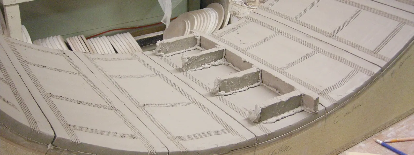
Victorian Kachelofen Project, part 1

Earlier this year we completed the most ambitious project we’ve ever done, from both a design and logistical perspective! The project was to create a kachelofen/pizza oven/open fireplace unit in a Victorian home.

Designing the unit required a site visit to get a sense of any architectural features that we could include. Several rooms in the house have raised wooden panels with delicate beading. These seemed like the perfect pattern to base our standard kacheln on. We ended up rotating the pattern vertically to better suit the project.

We also matched several other elements of our design to existing house parts.

One of our favourite elements is the doric column pattern that we used for the fireplace.

One of the stated goals of the project was to make something that felt like it belonged in a heritage building. Renovations were still ongoing when we completed our part of the project. We can’t wait to see photographs once the rest of the job is complete!

An Old Oven with a New Home

detail from Oven of Fire and Myth

This Kachelofen is named “Oven of Fire and Myth.” It was originally created in 2011. At that time Jessica was working as a production potter, but really wanted to build kachelöfen. She had no clients for any stoves. It was a long, hard road to find her first clients, as here in Canada nobody knows about kachelöfen.

Jessica wanted to show that kachelöfen can be works of art. She decided that one way to find potential clients was to exhibit stoves in public art galleries. She was able to secure a show at a public art gallery in Guelph. Jessica teamed up with well known Canadian artist Ryan Price. Ryan used the clay surface as a canvas for his drawings. He primarily used an underglaze pencil for the work.

Ryan and Jessica installing the oven at the MSAC
The Oven of Fire and Myth at the Macdonald Stewart Art Centre

The oven was exhibited in two different public art galleries. It was originally shown at that the Macdonald Stewart Art Centre (now the Art Gallery of Guelph) here in Guelph in 2011. It was later part of a larger, solo exhibition at the Canadian Clay and Glass Gallery in 2014.

Installing at the Canadian Clay and Glass Gallery
Oven of Fire and Myth at the Canadian Clay and Glass Gallery

This was a very important part of our development as creators and builders of kachelöfen, so when it finally found a permanent home last year we were absolutely thrilled!

We have a new name!

Designing and building kachelöfen has been the focus of Stonehouse Pottery for several years now. We’ve been so busy however, that we never quite clued in to the fact that our business name had become an anachronism!

For our 30th anniversary we’ve decided to fix it! We’re proud to say that we have a new identity. We are now Stone House Kachelöfen.

We worked with talented designer Gareth Lind to come up with a gorgeous new identity. A love of the work of Scottish designer and architect Charles Rennie Mackintosh provided the starting point for the design. We adore the art nouveau feeling of this font (Xctasy Sans for those of you who are into fonts). We love Gareth’s attention to detail, and use of colour.

Our new wordmark and logo are wonderful:

This is what Gareth had to say about the ideas guiding the design:

Stacked words form the logo, just as stacked tiles form a kachelöfen. The key character – the Ö – is in orange, representing the door of the ofen. The umlaut is doubled to represent tiles and form a distinctive mark that is then used for social media and instances where you would like a more graphic look than the full wordmark.

We’ve got some big plans for 2019, and our new identity features prominently in them!