
bds
-
 alternative heat, canada, custom, efficient, fireplace, grundofen, kachel, kachelofen, masonry heater, Muskoka, stove, thermal mass heater, wood fire, wood stove
SHKO demonstration at the MHA
Jessica was a guest at the Masonry Heater Association of North America again! As always, the conference was held at…
-
 alternative heat, canada, custom, custom design, custom wood stove, efficient, fireplace, grundofen, kachel, kachelofen, masonry heater, thermal mass heater, wood burning stove, wood stove
An Ambitious Project
This was one of the most challenging ovens that Jessica has undertaken. One of our medium sized ovens might contain…
-
 alternative heat, custom, fireplace, grundofen, kachel, kachelofen, masonry heater, thermal mass heater, wood stove
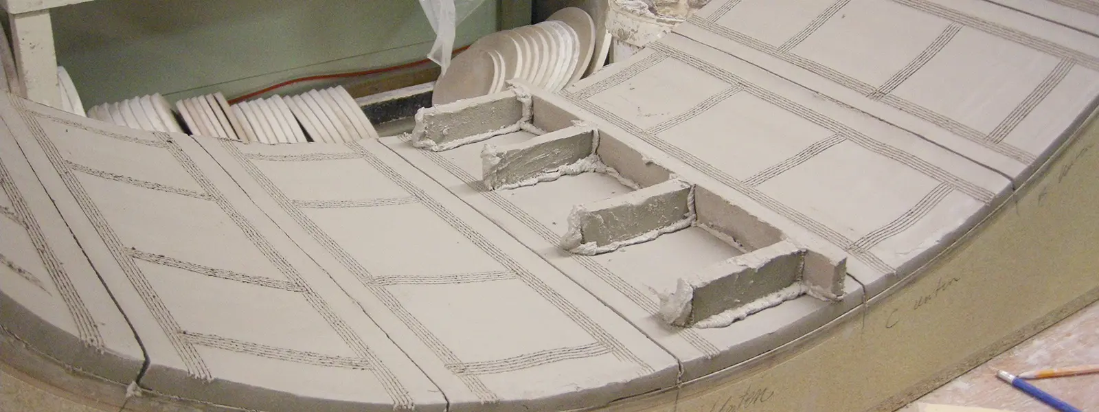
Crown Corners
The crown corner kacheln are usually the largest pieces in one of our projects. They tend to get made toward…
-
 alternative heat, canada, custom, design, fireplace, grundofen, kachel, kachelofen, masonry heater, round, thermal mass heater, warm, warmth, wood stove
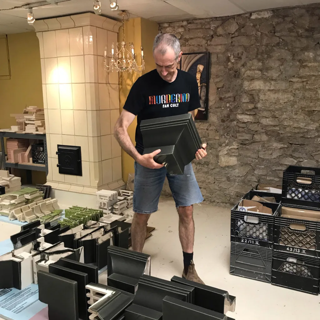
Final Firing
It always feels great once the last few pieces of a project come out of the kiln. Our natural workflow…
-
 bake oven, custom, Design Ideas, grundofen, kachel, kachelofen, thermal mass heater, warmth, wood stove
Looking Back to 2012
One of the most important projects in Jessica’s development as a designer of kachelofen was the “St. Gallen” from 2012.…
-
 alternative heat, custom, kachel, kachelofen, masonry heater, round, thermal mass heater, wood stove
Round Oven Gallery
We’ve done quite a few round ovens over the years. Here are some of our favourites:
-

Victorian Kachelofen Project, part 2
One of the most challenging moulds that we’ve ever made was for this project. We wanted to reference the existing…
-

Article in Swiat Kominków
Last year we were featured in issue #58 of Świat Kominków (Fireplace World), a beautiful and glossy Polish publication dedicated…
-

Victorian Kachelofen Project, part 1
Earlier this year we completed the most ambitious project we’ve ever done, from both a design and logistical perspective! The…
-
An Old Oven with a New Home
This Kachelofen is named “Oven of Fire and Myth.” It was originally created in 2011. At that time Jessica was…
-
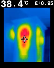
Thermal Photographs
We received a delightful email from a customer who made infrared images of one of our Kachelofen. The results are…
-

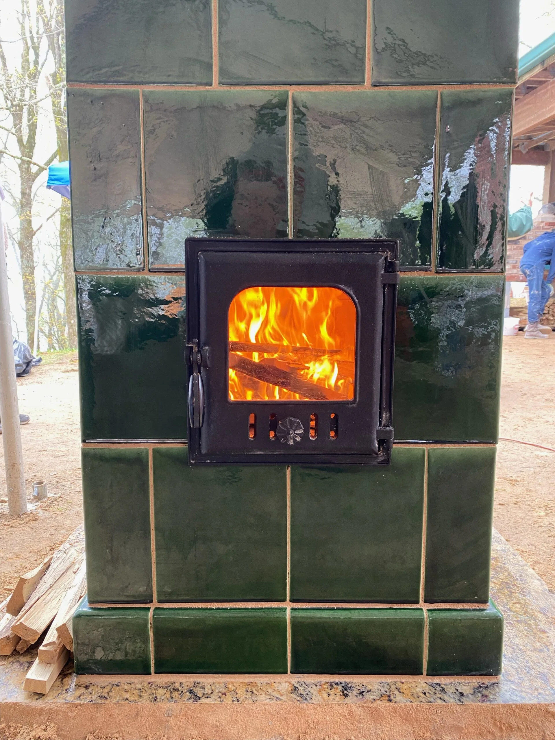
Blue Ridge Mountains!
We’ve just shipped two skids of Kacheln off to the Blue Ridge Mountains! This project is a two-sided Kachelofen in…
-
We have a new name!
Designing and building kachelöfen has been the focus of Stonehouse Pottery for several years now. We’ve been so busy however,…