An Old Oven with a New Home

detail from Oven of Fire and Myth

This Kachelofen is named “Oven of Fire and Myth.” It was originally created in 2011. At that time Jessica was working as a production potter, but really wanted to build kachelöfen. She had no clients for any stoves. It was a long, hard road to find her first clients, as here in Canada nobody knows about kachelöfen.

Jessica wanted to show that kachelöfen can be works of art. She decided that one way to find potential clients was to exhibit stoves in public art galleries. She was able to secure a show at a public art gallery in Guelph. Jessica teamed up with well known Canadian artist Ryan Price. Ryan used the clay surface as a canvas for his drawings. He primarily used an underglaze pencil for the work.

Ryan and Jessica installing the oven at the MSAC
The Oven of Fire and Myth at the Macdonald Stewart Art Centre

The oven was exhibited in two different public art galleries. It was originally shown at that the Macdonald Stewart Art Centre (now the Art Gallery of Guelph) here in Guelph in 2011. It was later part of a larger, solo exhibition at the Canadian Clay and Glass Gallery in 2014.

Installing at the Canadian Clay and Glass Gallery
Oven of Fire and Myth at the Canadian Clay and Glass Gallery

This was a very important part of our development as creators and builders of kachelöfen, so when it finally found a permanent home last year we were absolutely thrilled!

We have a new name!

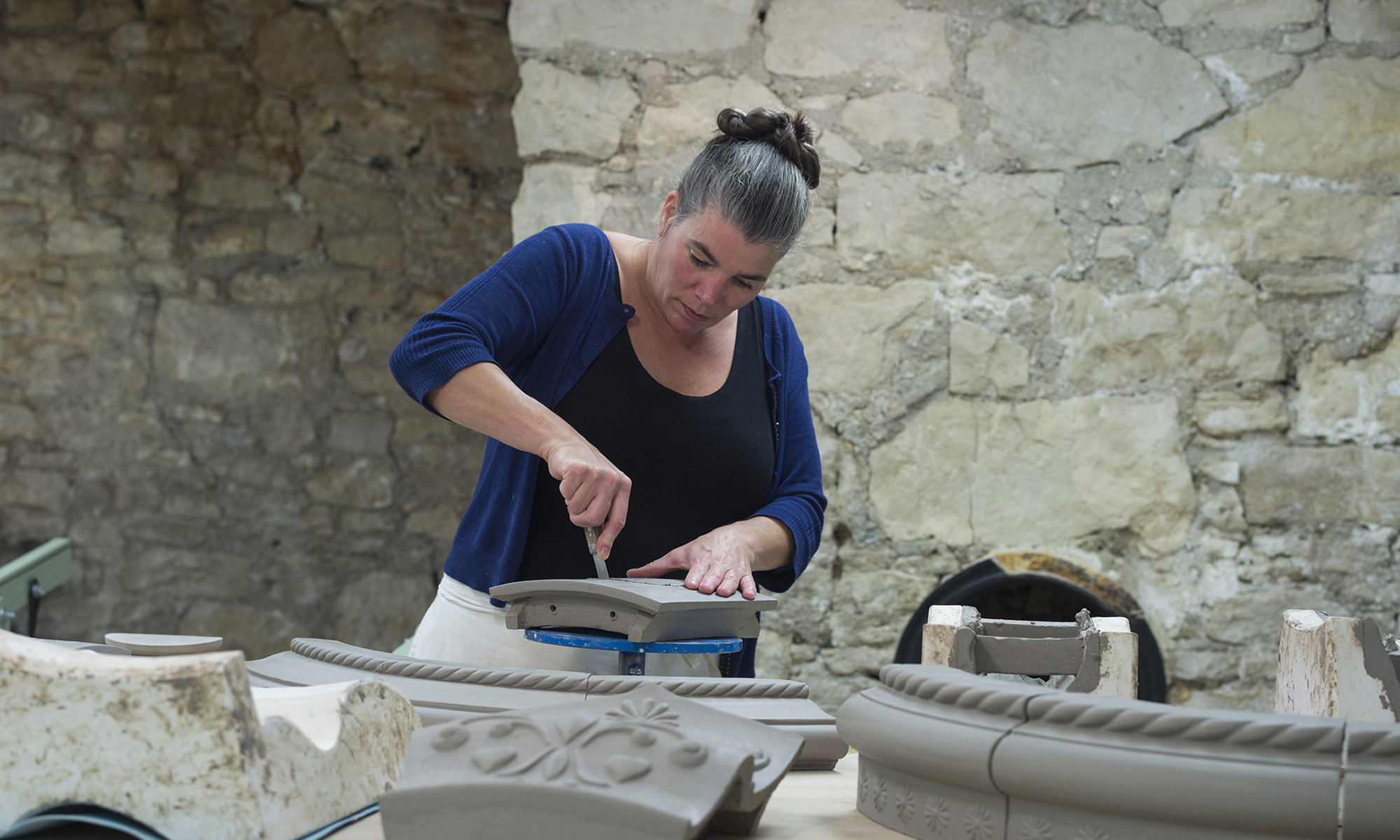
Designing and building kachelöfen has been the focus of Stonehouse Pottery for several years now. We’ve been so busy however, that we never quite clued in to the fact that our business name had become an anachronism!

For our 30th anniversary we’ve decided to fix it! We’re proud to say that we have a new identity. We are now Stone House Kachelöfen.

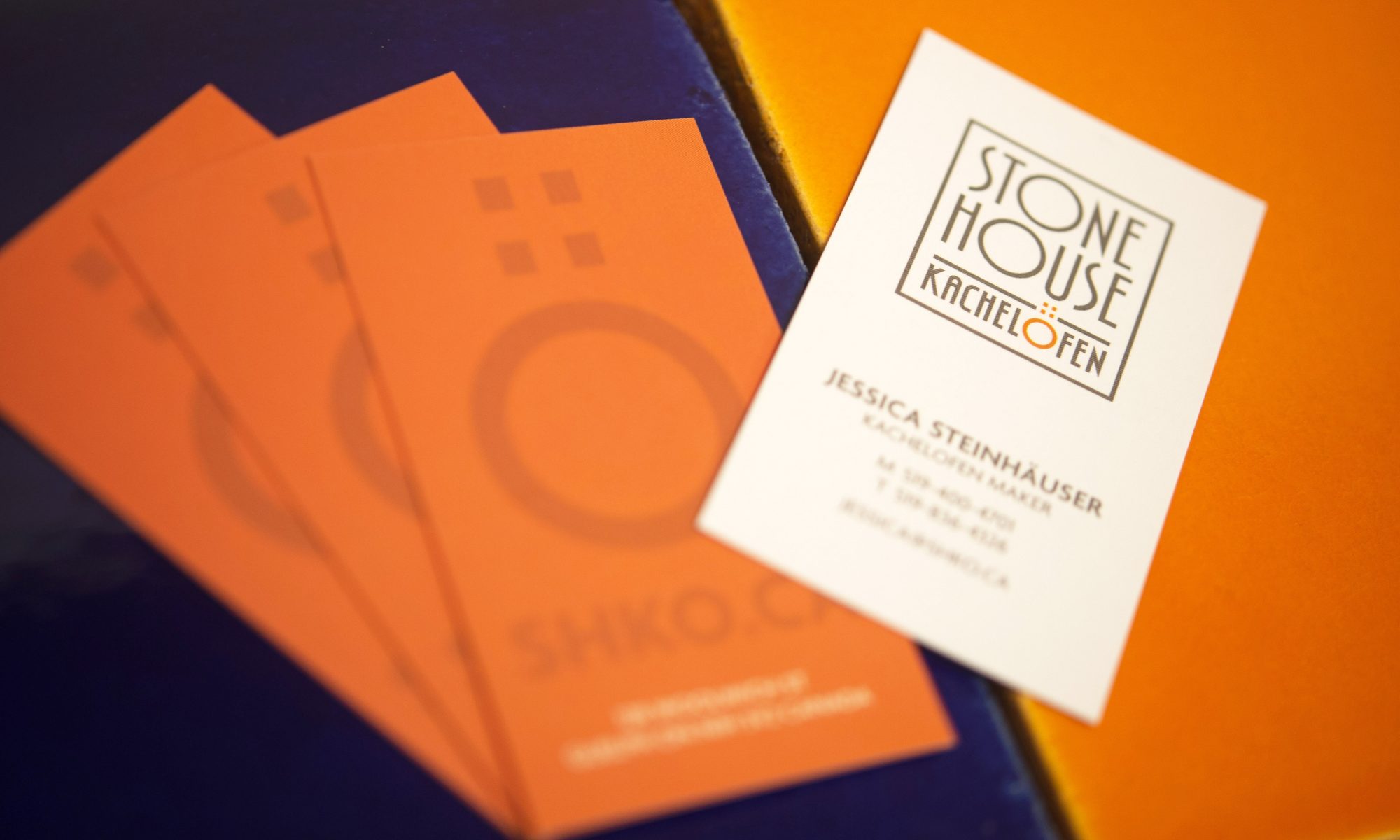
We worked with talented designer Gareth Lind to come up with a gorgeous new identity. A love of the work of Scottish designer and architect Charles Rennie Mackintosh provided the starting point for the design. We adore the art nouveau feeling of this font (Xctasy Sans for those of you who are into fonts). We love Gareth’s attention to detail, and use of colour.

Our new wordmark and logo are wonderful:

This is what Gareth had to say about the ideas guiding the design:

Stacked words form the logo, just as stacked tiles form a kachelöfen. The key character – the Ö – is in orange, representing the door of the ofen. The umlaut is doubled to represent tiles and form a distinctive mark that is then used for social media and instances where you would like a more graphic look than the full wordmark.

We’ve got some big plans for 2019, and our new identity features prominently in them!